Showing posts with label 211. Show all posts
Showing posts with label 211. Show all posts
Thursday, October 20, 2011
Thursday, October 13, 2011
Wednesday, October 12, 2011
Wednesday, October 5, 2011
Monday, October 3, 2011
Reflections
Interior Reflections:
Artificial Light
Light and Shadows effecting Objects
 |
| This movie poster, like most movie posters, puts the name at the top of the hierarchy, followed by an image to draw in the viewer, and then the information about the movie in smaller text. This poster's use of a complementary color scheme and clear order makes it an effective composition. |
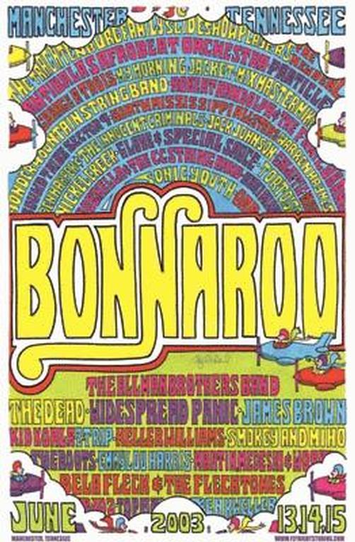
 |
| This composition draws attention the name of the festival first and then allows your eye to travel to the names of the artist playing and down to the date of the festival. I think this poster is effective at expressing all of its information. |
Tuesday, September 20, 2011
Reception Area: Some inspriation :)
| http://ih0.redbubble.net/work.2355356.4.flat,550x550,075,f.archicad-render-barn-conversion-holiday-home-reception-area.jpg |
| http://tftscdn.nexus404.com/Blog/wp-content/uploads2/2008/02/b747-reception-desk.jpg |
 |
| http://ts2.mm.bing.net/images/thumbnail.aspx?q=1147848036181&id=3ad3a18e43615b8e625c192c6838775d&url=http%3a%2f%2fimage.made-in-china.com%2f2f0j00QeGtCzZlYVbM%2fCeiling-Lamp-54756-915-.jpg |
 |
| http://www.chenel.com/images/diaporamas/b1c587a988db71e20f448029768c7c98.jpg |
 |
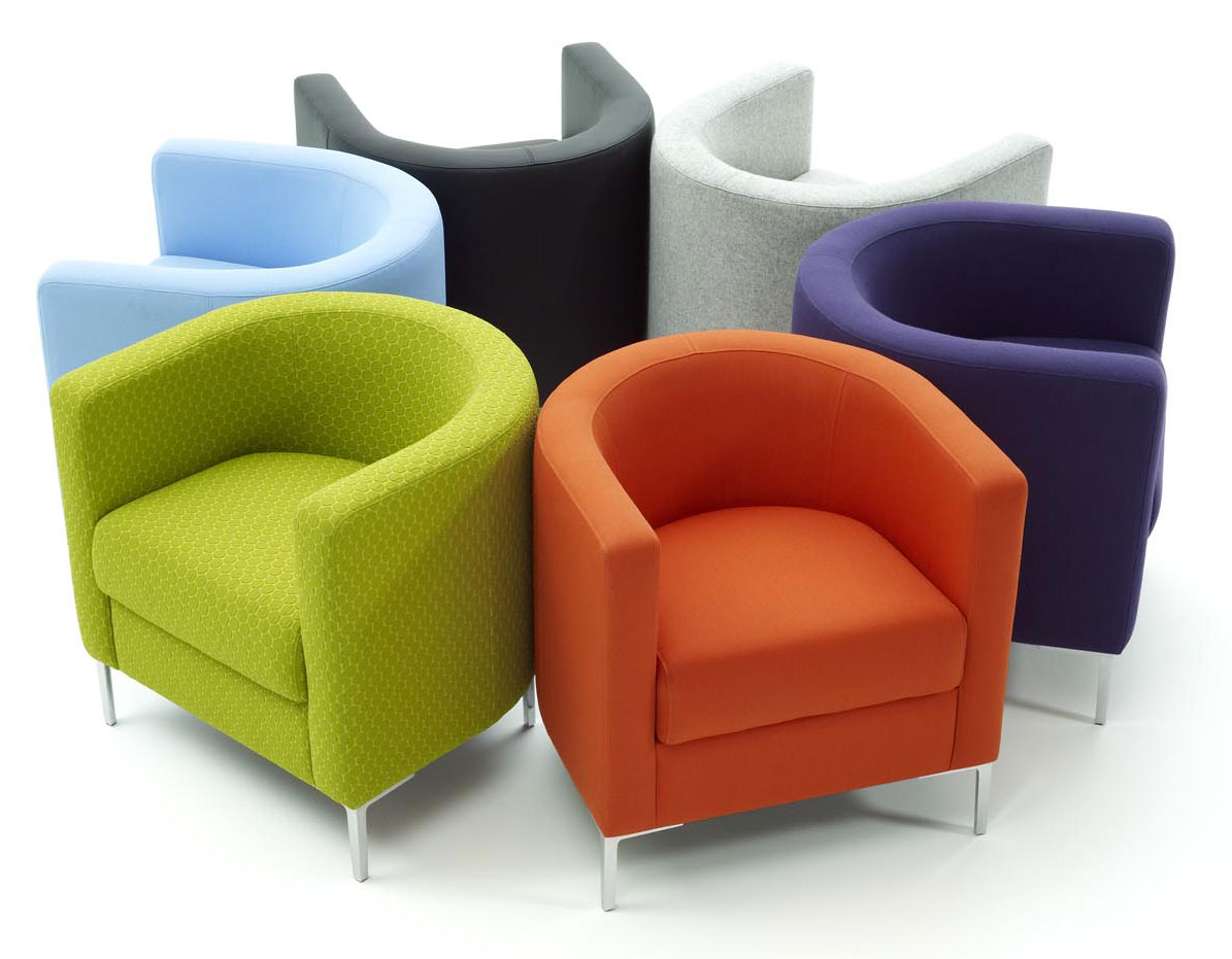
| http://foldingchairsandtable.com/wp-content/uploads/2010/06/Modern-Colored-Tub-Chairs.jpg |
 |
| http://bedzine.com/blog/wp-content/uploads/2008/04/040108bookcase.jpg |
Thursday, September 15, 2011
Header Project
In our class we had to make a header for a class mate that accurately reflected their style, and they had to do the same for us...
 |
| This is the one Matt made for me. He made it more organic and shape and colorful to represent me. I like how it turned out :) |
 |
| This was my rough draft for Matt's name tag |
Thursday, September 8, 2011
Wednesday, August 31, 2011
Concept:
A Coconut Cupcake
Related to the Principles of Design:
Proportion: The cupcake itself is an individual proportion. It is meant for one person to enjoy.
Balance: The icing balances the cupcake and makes it evenly divided
Unity: The cupcake is made up of multiple parts. Many ingredients come together to create the cake. Then there is the icing and the coconut topping. However, they all come together to create a unique blend of flavors, and only with this unity can it be a coconut cupcake.
Emphasis: The emphasis on this particular cupcake is the coconut. It's what makes this cupcake different from others.
Rhythm: The ribbing of the wrapper provides a nice rhythm for the cupcake, as well as the swirl on top. It's a rhythm I know and love and can associate with a cupcake when I see something similar.
Related to the Elements of Design:
Space:
Line: The only defined lines come from the ribbing on the wrapper, straight lines that contrast the rounded form on the cupcake.
Color: The colors in a coconut cupcake are light; yellow, cream and a toasty tan.
Value: There isn't much change in value in a coconut cupcake. There is a more analogous relationship between colors than a complementary one, so little contrast in color.
Form: The cupcake has a sweet and rounded form, dictated by the container it is cooked in.
Shape: The shape of a cupcake is rounded on the top and sides with a flat bottom to rest on.
Texture: The texture of a coconut cupcake is the best part. The base is moist and fluffy, the icing is soft and thick, and the coconut on top is irregular and stringy.
Subscribe to:
Posts (Atom)


